
Learn to recognize the 6 key price patterns in trading
A chart stripped of all indicators will give you a fine reading of the behavior of the crowd that tirelessly shapes the recurring price sequences found in the markets.
Even today, I wonder about this regularity and harmony that presides over major movements.
Is there a self-perpetuating mass phenomenon? Like the famous self-fulfilling predictions?
Would the mass of traders anticipating a "known" price structure participate in its creation, formation and repetition?
In my opinion, no. In any case, not consciously.
I am convinced that the crowd of millions of traders and investors acts in the same way as a school of fish or a flock of starlings (a beautiful phenomenon to watch, called "whispering") and thus constitutes a homogeneous group in which each individual participates in a natural but unreflected global movement.
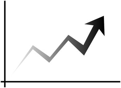
Chart analysis allows us to read each time a specific story and very often we can see that the most powerful movements emerge from harmonious and orderly bases.
And the less interference, and therefore the fewer indicators, derived from price or volume, the better your understanding of the story this crowd is telling you.
Don't forget that the crowd follows its leader, which is the price. So why look at anything other than the price? Everything else is just a distraction in my opinion.
The price is more than enough to not only see things with an objective and unbiased eye but also to follow the movement as long as the trend lasts.

Adding an indicator like RSI, MACD or any moving average will not only limit your ability to observe and analyze things as they really are and not as they should be but will also limit in most cases the amplitude of the movement you will be able to capture.
How many stocks have I seen cross all the "logical" price levels, all the reference moving averages that most people considered as ceiling price levels, not to mention the RSI that was already at a block level halfway through the movement?
This is a strong opinion I have on the matter but it is supported by an in-depth empirical analysis of the subject: price and volume are enough and the less indicators you use the better, generally speaking.
I don't want to offend those who use indicators in their trading activity and their approach can be quite profitable for them.
I'm just an advocate of keeping it simple.
Let's get back to the subject at hand, namely the price/volume structures that have a sufficiently reliable statistical advantage to consider dealing with them systematically.
I am not the author of any of the following structures.
Most of them are well explained and documented.
And this directory is not meant to be exhaustive and you may well discover other structures but I only use those so far.
This means that it is useless to reinvent the wheel and that it is essential to use what has been discovered and worked before us.
However, these configurations are not an end in themselves. Many structures that look like the ones I am about to present to you may fail.
But with experience and when you have "read" and analyzed thousands or hundreds of thousands of charts, you will be better able to distinguish between the most reliable structures and those that are much less reliable.
The brain is an unbeatable tool for recognizing the slightest nuances in the quality and harmony of a structure as long as you feed it enough of what to observe.
One last word before starting to analyze and read these different patterns: recognizing price sequences is a first step towards consistency and performance of the trader but it is not enough.
It is necessary to integrate this expertise into the larger framework of a complete trading system that includes risk management, control of your emotions, backtesting, a logbook, an exit strategy, discipline, etc.
My credo is and will remain: "a good trading strategy is not enough to be consistently successful".
I took the option of not putting arrows or additional indications on the chart, on the one hand not to overload it and make it unreadable and on the other hand in an educational interest so that you can start to get used to read naturally the story that these charts tell you without unnecessary frills.
For each stock, I have produced here first the chart of the day of the entry bar and then a second chart of the movement that follows this break.
Finally, you can click on each of the graphs to enlarge them.
1-The cup with handle
A very classic structure and highlighted for the first time by the great William O'neil.
It is a structure that is generally formed by an initial upward movement (1) followed by a downward movement that forms the bottom of the cup (2), a recovery that stops a little below the previous high and then a plateau with a slight overhang (the handle) (3), during the formation of which the "weak hands", impatient, progressively exit just before the upward explosion at the time of the breakout.
The pivot point, i.e. the optimal place to enter, is the high of the handle (here around $2.35).
Note that the recovery stops below the high of the structure. Many traders who bought at this price level exit before the value reaches their cost price, happy to exit at a lower cost.
VVPR-august 2020-pivot point (first bar price)

Ideally, the crossing of the pivot point (here the high of the "handle" at $2.35) should be done in volumes provided relative to the last sessions.
The big reversal of June 17, 2020 is accompanied by "monstrous" volumes that visually crush the bar of volumes of the day of the break, which are nevertheless significantly increased and above all sufficient if we look closer.
VVPR-august 2020-after crossing the pivot point

AYRO-november 2020-pivot point (first price bar)

It is a particular case of the cup with handle since no previous movement presides over the formation of the structure as it is often the case within the framework of trades of bottom fishing.
This trade appears obvious because the structure is so harmonious and the proportions are right.
We can notice the phenomenal explosion of the volumes at the moment of the breakout.
AYRO-november 2020-after crossing the pivot point

2-The FLAT BASE
AHPI-february 2020-pivot point

The flat base, as its name indicates, is a zone of contained consolidation where prices remain within a more or less narrow zone. The best structures are characterized by a zone of volatility compression compared to the previous, often more erratic, downward movement.
Here on AHPI, after a major rise in the share price, which jumped by about 200%, prices retraced significantly to recover slightly before building a zone where volatility contracts before breaking upwards like a "compressed" spring that is suddenly released. One point to note is that recent past historical volatility is often a good indicator of future volatility.
AHPI-february 2020-after crossing the pivot point

"The movement following the pivot point breakout zone, higher on this Flat Base..."
IZEA-march 2020-pivot point
We find here the same principle as before with a narrow zone (or range) of accumulation on the same price zone for two weeks after a less harmonious downward movement.
IZEA-mars 2020-after crossing the pivot point

A sharp and explosive movement follows the break of this Flat Base in particularly high volumes.
3- The double bottom
TKAT- april 2021-pivot point
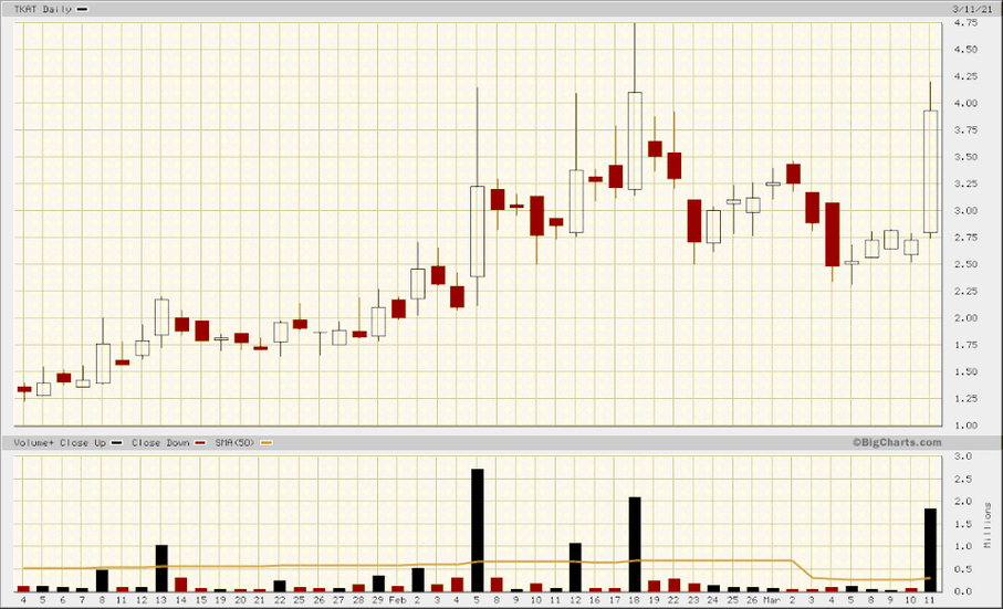
The double bottom is a very well known price/vomume pattern but less frequent and often less powerful than the Cup with Handle.
It is always better to enter on the basis of these patterns after a preceding upward movement.
Most of the price structures mentioned here are nothing more or less than resting areas, consolidation areas where stocks change hands before moving back in the same direction as the first upward movement that preceded them.
The classic double-bottom pattern is characterized by an initial major upward movement that eventually runs out of steam.
This is followed by a first correction, which is the first low of a W, followed by a recovery that runs out of steam before the first relative high, and then a new downward movement that literally takes out the "weak hands" who were wrong to place their stop below the first low.
We find the same mass psychology seen in the Cup with Handle which leads traders who entered at the high to exit close to their price without waiting any longer.
Then the pivot point is located on the intermediate high of the structure.
It is interesting to note in the example opposite the harmony of the structure with as many bars forming the first part of the structure as the second (7 bars).
TKAT-march 2021-after crossing the pivot point

It went up to $74 afterward...
4- The CUP WITHOUT HANDLE
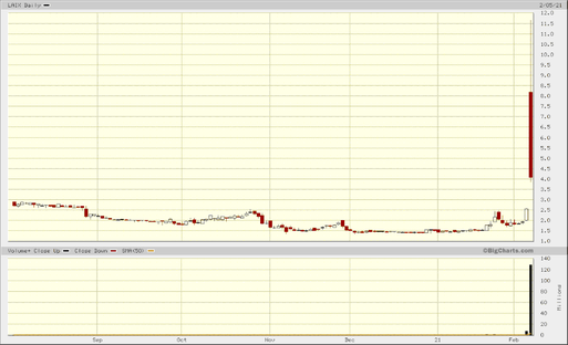
LAIX-february 2021-after crossing the pivot point
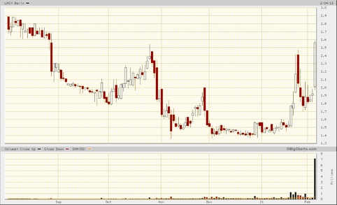
Less common and I would say often less powerful than its cousin the Cup with Handle, the Cup without Handle is a bowl without a handle that somehow doesn't take the time to evict traders who get bored during the formation of the handle found in the Cup with handle.
LAIX-february 2021-après le franchissement du point-pivot
An explosive movement that resulted in a major reversal the very next day.
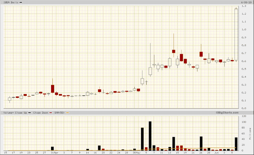
VXRT-june 2020-pivot point
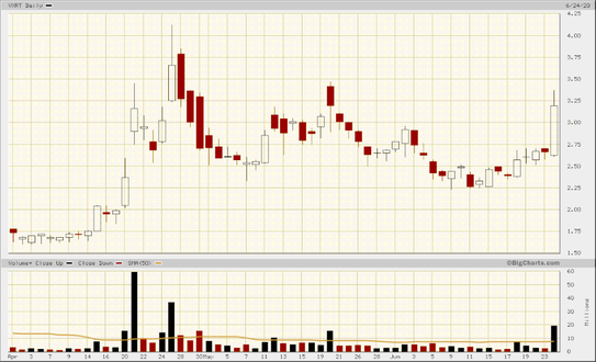
VXRT-june 2020-after crossing the pivot point

5-The descending WEDGE
BPTH -March 2019-pivot point
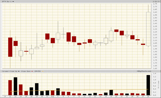
The descending wedge appears as a descending staircase that follows an earlier upward movement in the stock price.
What is important to note here is the visual harmony of this "clean" structure, which appears as a gradual unconvincing correction at ever lower prices, as if the stock were passing from unconvinced hands to those of more astute and above all more patient traders who are taking advantage of a lower and lower cost price until they give in to the temptation to buy massively, perhaps frightened by the prospect of the imminent end of this period of sales...
BPTH -Mars 2019-after crossing the pivot point

KODK -July 2019-pivot point

KODK -July 2019-after crossing the pivot point

6-The resistance line breakout
The break of a resistance line is a configuration that can be very powerful. It appears as a fairly long period of consolidation (sometimes several months) relatively homogeneous like a Flat base with at least 3 unsuccessful attempts to cross a clear resistance level in the form of what I call volatility spikes (reversals on large volumes).
The crossing of this resistance is often done from above on record volumes with a gap.
BOXL-Mars 2020- point pivot

We notice here an obvious strong resistance zone with several attempts (6 in total in 2 months) on the 1,3$ which ended by systematically by a failure until July 10, 2020 where a violent break on exceptional volumes prevails
Same configuration with several contact points in the $1.5 area in 2 months.
BOXL-mars 2020-after crossing the pivot point

FTEK Mars 2020- point-pivot

Same pattern with several contact points in the $1.5 area in 2 months.
The stock finally crosses to climb some 300% in 2 days.
FTEK March 2020-after crossing the pivot point
FTEK-March 2020-after crossing the pivot point


Write a comment